In 2016, the Financial Times launched a new version of its website. With a 30% increase in engagement, the launch was a success for many readers—but not for everyone.
Accessibility for the web, or “a11y” for short (a type of abbreviation called a numeronym), is the practice of ensuring web content is accessible for everyone. It helps to prevent discrimination against people with disabilities, by conforming to coding standards such as WCAG (Web Content Accessibility Guidelines).
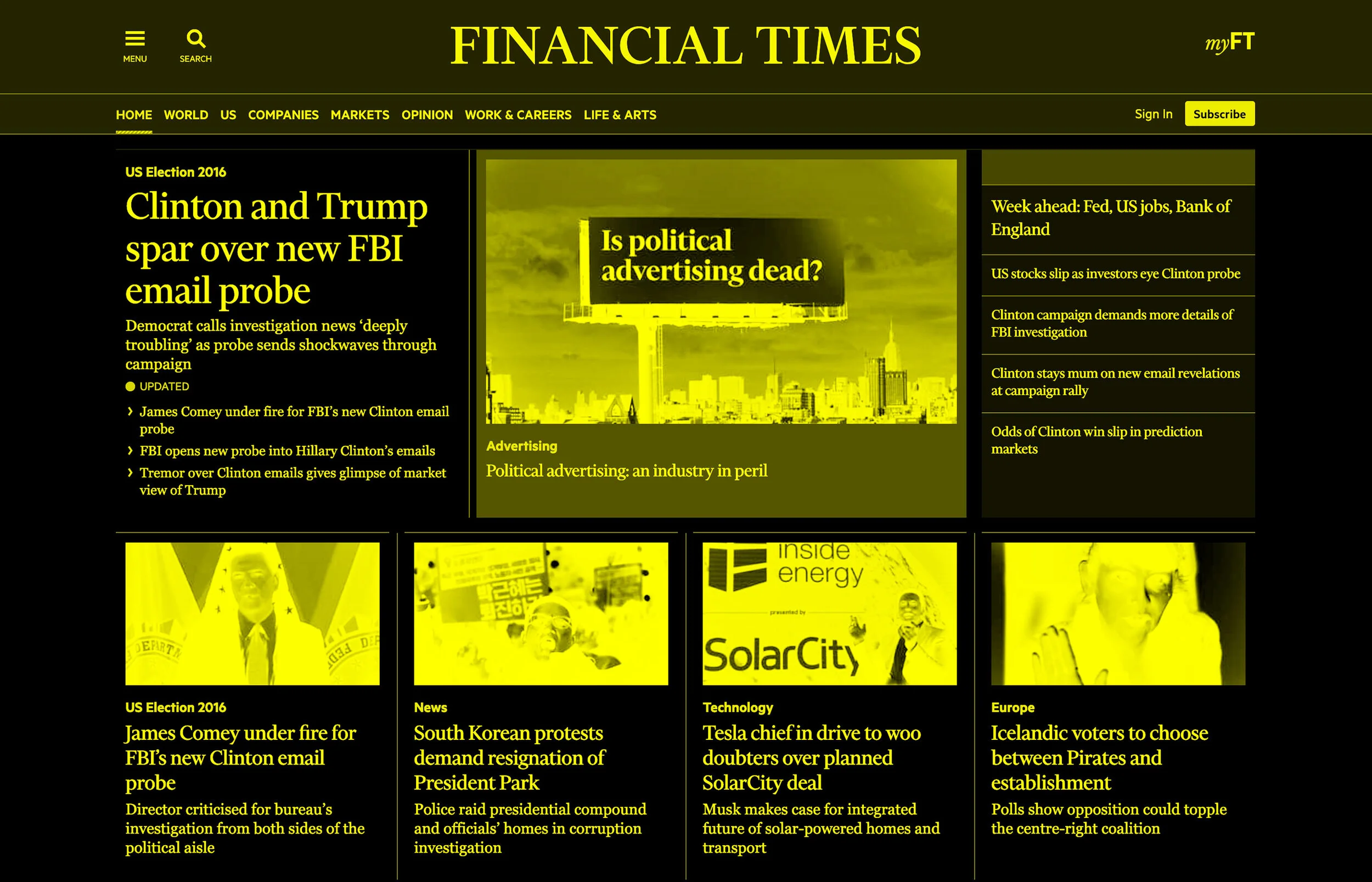
Some of our users prefer to view websites in high contrast mode
The World Bank Group estimates that 1 billion people live with a disability—that’s 15% of the world’s population. So it’s vital that we design responsibly and consider the impact of our work on others.
Two years of prodding and probing had taken its toll on the FT’s visual language and its accessibility game was way off. After its maiden voyage, we undertook a project to improve standards across FT.com, to raise awareness and ultimately gain AA Level WCAG accreditation. No mean feat for a newly-fledged publishing platform I can assure you.
From colour contrast to button states, design played a pivotal role, and the entire process made us think differently about the choices we make. We installed plugins like Stark and Oracle, and initiated best practices across teams, because, let's face it, accessible websites are undeniably better. They're coded better, which makes them faster, they have better SEO and they're just better to use for everyone.
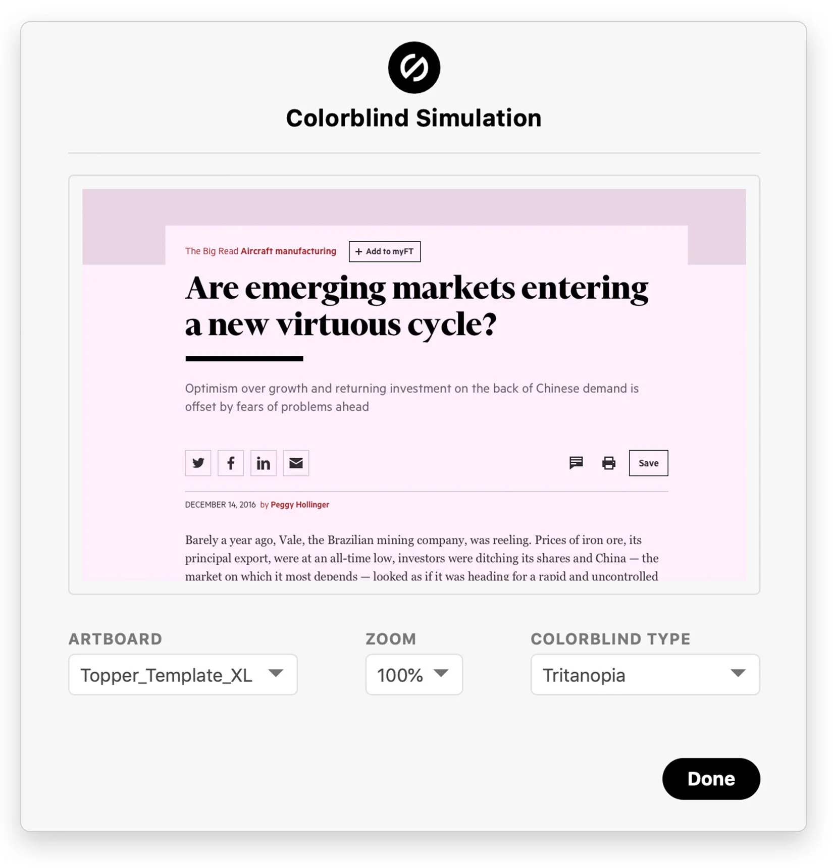
Stark for Sketch - A colour-blind simulator and contrast checker.
The initiative also provided an opportunity to reform our design language. Subsequently feeding those updates to our design system, providing a compliant and consistent brand experience to all digital products that fell under the FT umbrella.
So we got to work, starting with the colour component because almost every other component depends on it, but most importantly colour and contrast is critical to building accessible content.
We streamlined a palette of 64 down to 16, including a slightly pinker and more appropriately titled ‘Paper’. Additionally, we developed a system within the component library that dynamically produces tints and shades from the palette to generate contrasted text based on an element’s background colour.
Because the system uses Sass mixins and functions to do all this wizardry, the component can automatically test colours to see if they pass WCAG. If a particular combination fails to pass the minimum requirements, it will kindly serve you an error.
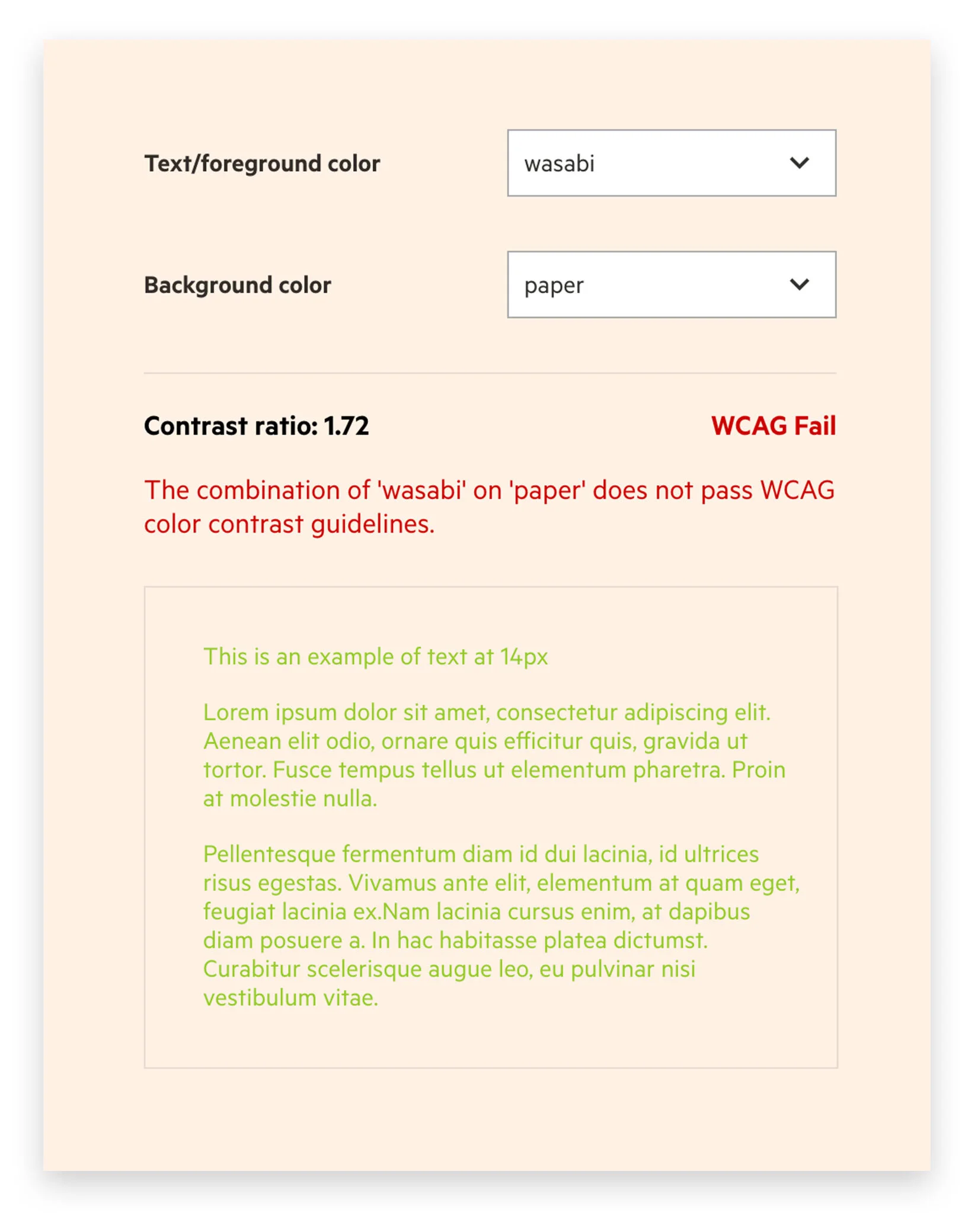
Origami Colour Mixer
After colour, came typography, then Buttons, and so on and so on to create a robust and accessible design system.
FT.com is constantly evolving, it deploys hundreds of updates a month without you knowing it. As hard as it is to admit, perfection is seldom achieved in such a progressive environment — but that’s not a bad thing. Our world is changing every day, and it’s how we adapt during these changes that will enable us to create truly inclusive experiences.
Achieving WCAG accreditation had its challenges, but imagine trying to fill out a form you can’t see or clicking a button you can’t press. The a11y project started out as a means to an end, but it’s a journey that will continue, ingrained into our design thinking, learning every step of the way.